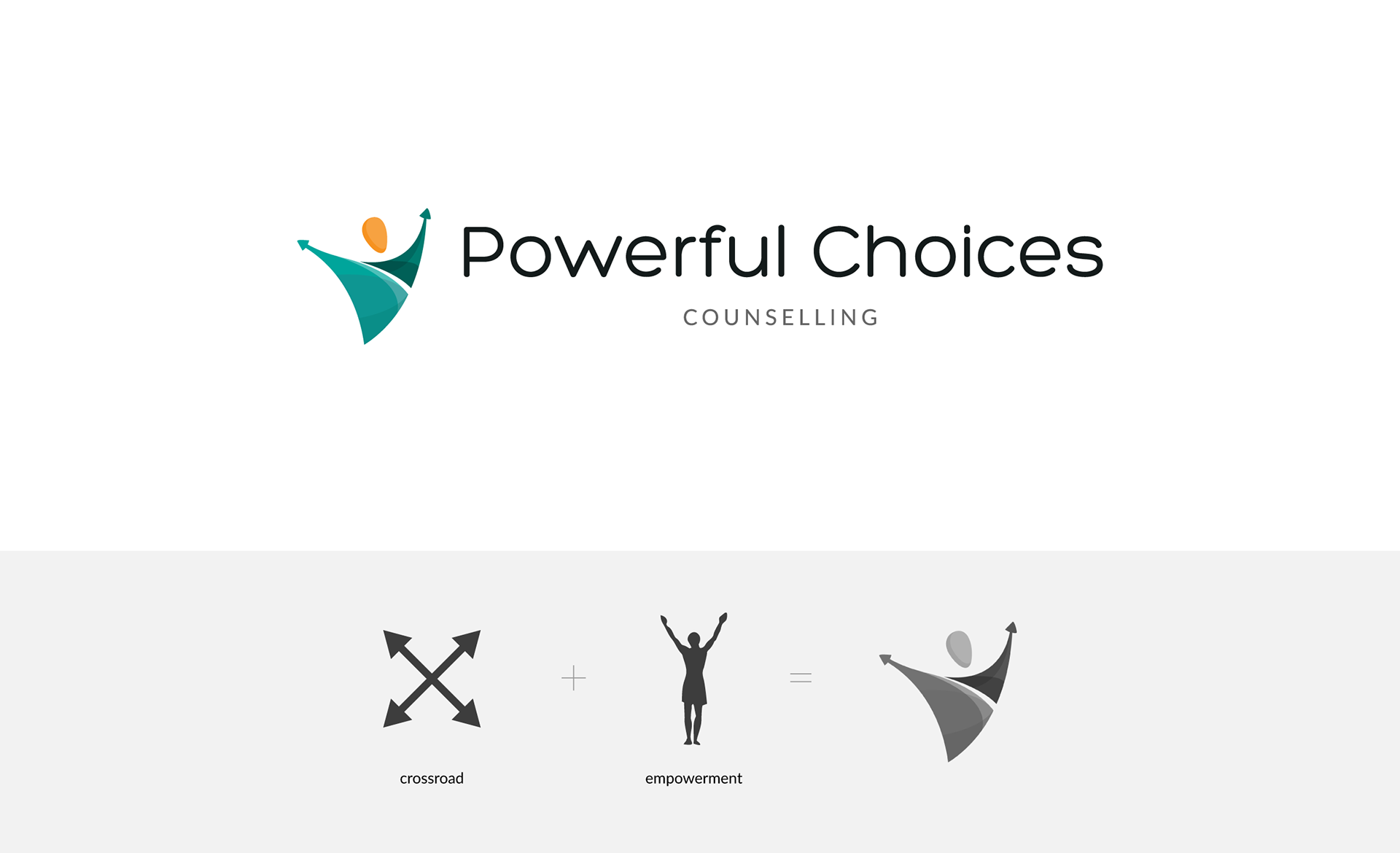
The client contacted me to create a logo for his new counselling practice. The focus of Powerful Choices Counselling is on the needs of boys, adolescents and men in the context of their family and community.
For the logo, I worked with the idea of 2 diverging paths representing choices, that at the same time can be read as a stylised person lifting arms as a sign of empowerment. The colour palette includes shades of green because they're considered masculine colours but are also soothing tones. I added accents of orange to give it a more vibrant, youthful feel. The typography has been selected to be inviting and friendly.
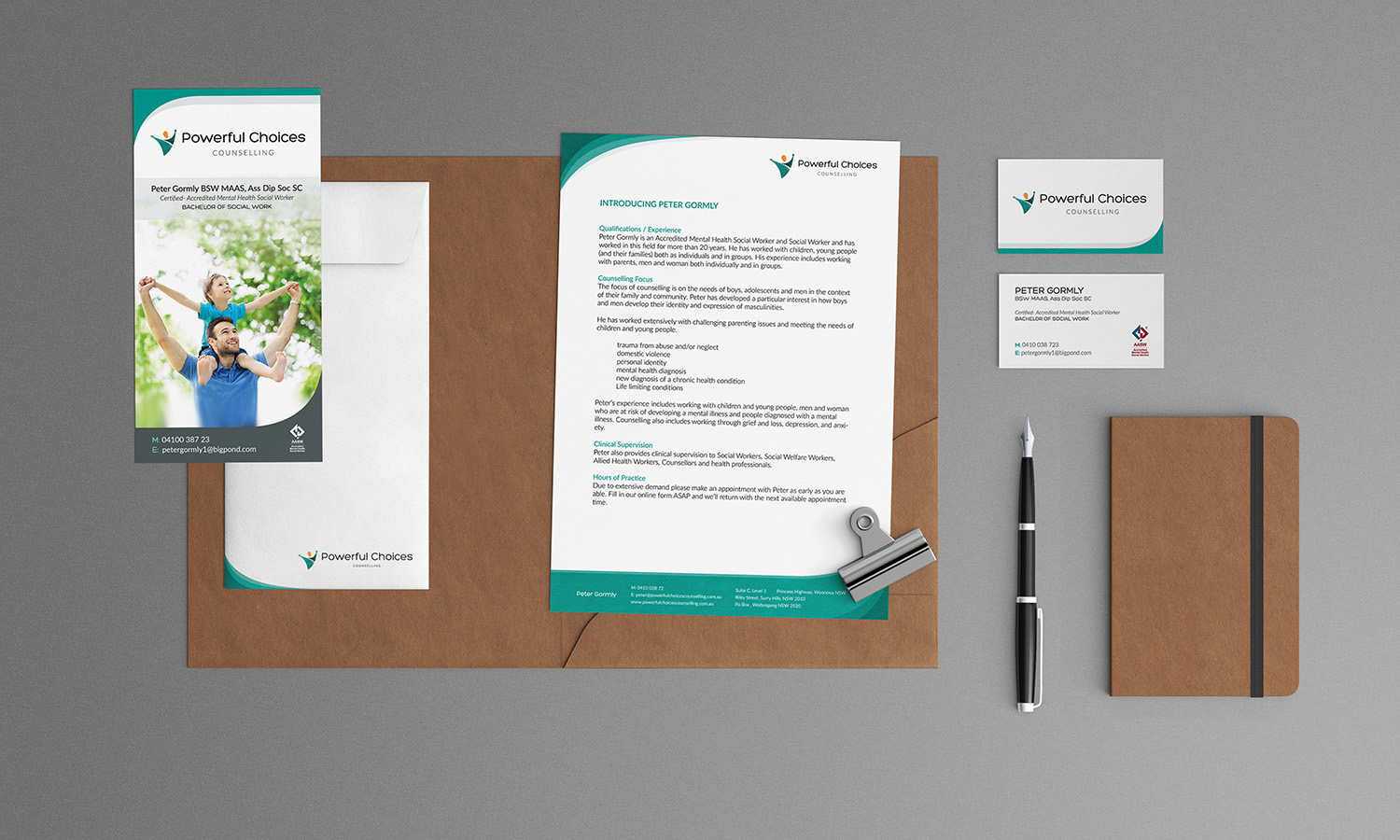
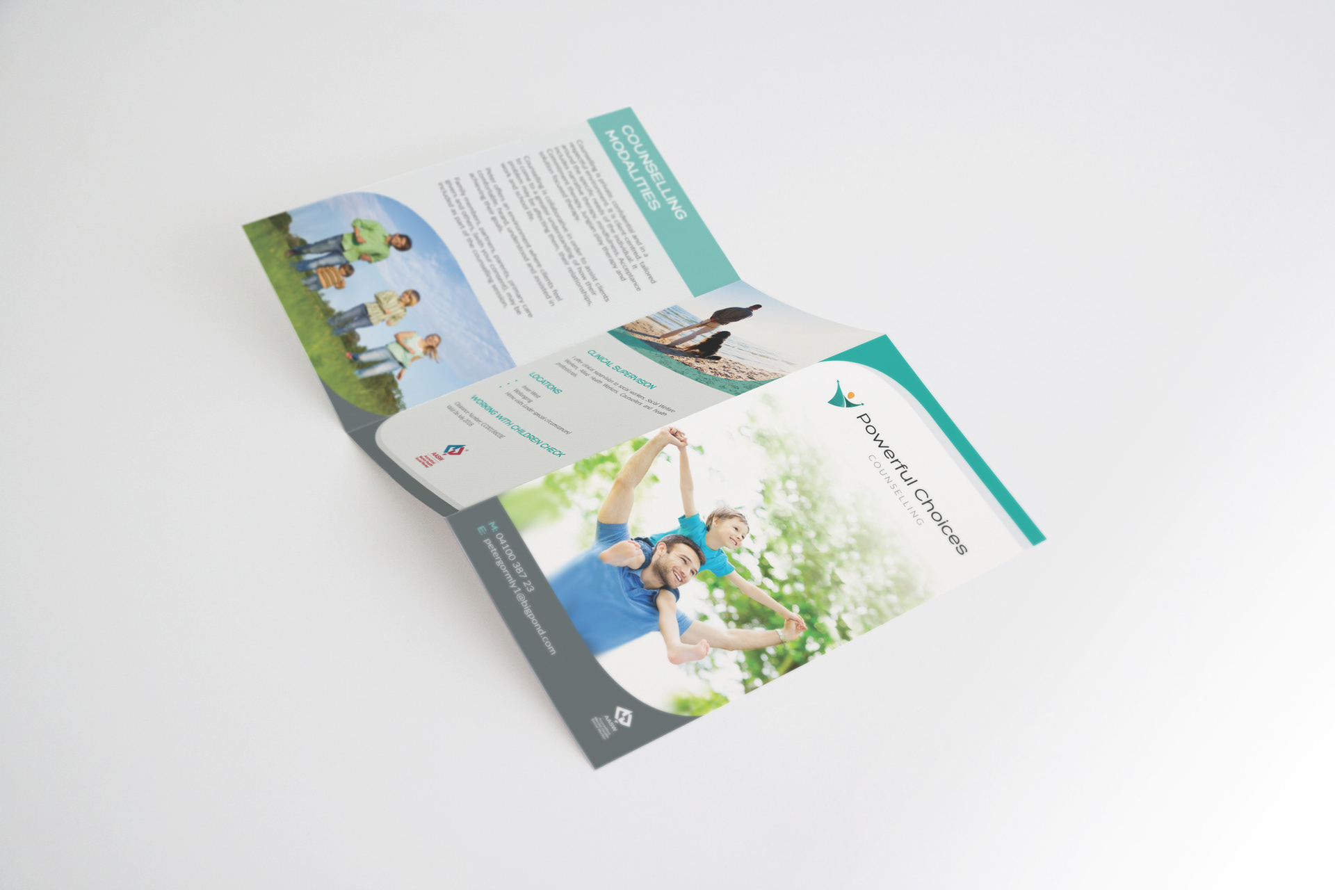
I also created a brochure, letterhead, business card and other materials as part of the new visual identity.